Working with the product side of the business to enhance the new support site.
Challenge
The wider product team were working in Zendesk to build a new support site, combining ‘how to…’ articles with technical documentation. This request was initially cosmetic, however some of the user journeys were also quite complex. There was limited knowledge of HTML/CSS within the project team in order to implement the changes, so as someone with this experience and knowledge I would also need to implement the designs, however with this being built using a Zendesk template with specific functionality the options were limited.
Solution
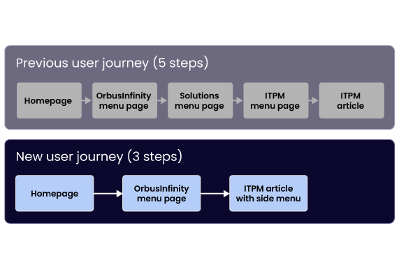
1) Reduce the amount of steps a user needs to take to get information from 5 steps to 3 steps 2) Align the UI of the site closer to the Orbus visual identity 3) Increase the clarity of the content and CTAs 4) Improve the aesthetics of the site by keeping consistent styling and margins
I built up the small internal design team at Orbus, which developed a reputation for quality and consistency. This, along with outreach to the different teams in the business, meant that the wider product team felt confident coming to the marketing design team for assistance with this project.
The initial request was for a cosmetic update on the work that had been done already using a template, but during discussions I identified issues which design could solve (and some which the wider team would work on).
The user journey
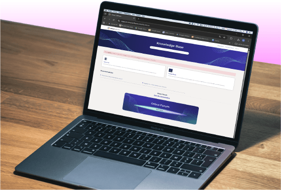
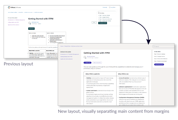
The content presented to me intially was black text on a white background, with undefined margins. The user journey meant that each section was a new page, so to get to an article the user would need to click through several pages of largely empty pages with links on them. This would have given a negative perception of the company if it went live as is, so there was plenty of scope to improve this, even if changes to layouts could only be done using CSS with existing div tags.
The solution
I decided to reduce the number of menu pages from five to three. The article pages already had a menu on the left side to allow for navigation around the site, and I was able to combine two menu pages into one.
Additional visual styling utilised coloured backgrounds and white boxes to separate the main content on a page. Additional padding and colours for note highlights allowed for easier navigation of the articles. I provided the CSS style sheets and some of the HTML to the product team for completion of the project and go-live.
Creating an internal brand identity, which would sit comfortably alongside the external-facing brand, as well as producing materials for internal campaigns. View project >
This successful campaign described how employees posed a security risk to businesses in three key ways- employee error, hacking and data exfiltration. View project >
This was a self-initiated project designed to improve sales conversions on the website. The original page had key information hidden behind tabs, which made for a limited user experience. View project >