This was a fast turnaround project needed for a webinar for the APAC region.
Challenge
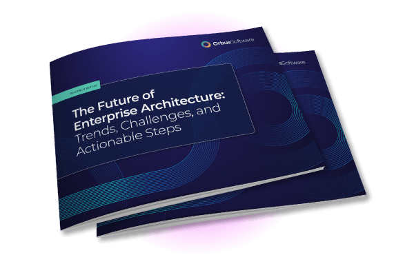
A webinar was due to be recorded live where one of the materials for takeaway was a report, where the webinar was to be in an earlier timezone (Australia vs UK). As this was a report, the biggest challenge was how to represent the information, and this would be the first report created. The information had to look credible, and not like a sales brochure.
Solution
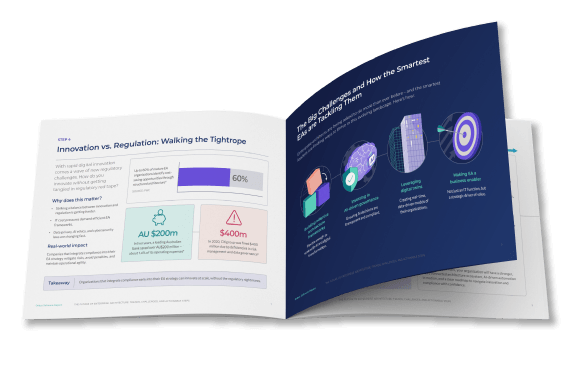
1) The visual treatment given to the results put the numbers front and centre, to lend credibility to the content
2) The layout used tonal colouring (white-grey-black) and visible grid lines and boxes, to represent graph lines and more serious publications
3) Clear headlines, subheads and paragraph spacing show visual hierarchy and allow content to be easily scanned. Grid structures and white space contribute to the ease of navigation
4) The layout was horizontal, so that all the content could be viewed on screen at once, without the need to scroll
This project had a tight turnaround of two days, particularly due to different timezones. This needed to include review time for the Australia team, however as there were no pre-exisiting templates or reports this would take more time to build.
As someone who built and managed the brand for this company, I wanted to ensure that the quality of the materials we were putting out did not suffer despite the timeframe. I needed to use my years of experience in order to create something that upheld the brand perception, but still represented the serious nature of the content.
The content
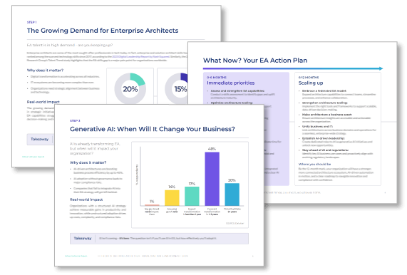
The content was supplied in a word document with links to the raw data. Different data points were highlighted, where suggestions of inclusion were made. I needed to understand the information to ensure that the content I chose to include supported the written word (the content had not quite been refined due to turnaround times).
Due to the tight turnaround, there was not time to experiment with different layouts, but I needed to include graph-like imagery so that the PDF document would look credible (and not like a sales piece).
A credible report
As well as the graph-style imagery, I wanted to include some shorthands that would make the material feel more like a report than a sales brochure. Using lines and blocking off elements reflected the structure of graphs and tables, and gave the layout a more corporate look. This particularly worked well for the action plan, which I represented similar to a timeline.
Visual elements
As well as ensuring the report looked credible, I wanted to ensure there was some aesthetic quality to the material, as it would represent the brand. I sourced and used a purchased pattern to give the material a theme, and created and reused illustrations in relevant areas.
Additional materials would be needed to run further promotions after the event, particularly across LinkedIn and email, where markets could be segmented.
Creating an internal brand identity, which would sit comfortably alongside the external-facing brand, as well as producing materials for internal campaigns. View project >
This successful campaign described how employees posed a security risk to businesses in three key ways- employee error, hacking and data exfiltration. View project >
This was a self-initiated project designed to improve sales conversions on the website. The original page had key information hidden behind tabs, which made for a limited user experience. View project >