A self-initiated project to improve communication effectiveness and to reduce the workload of the marketing team.
Challenge
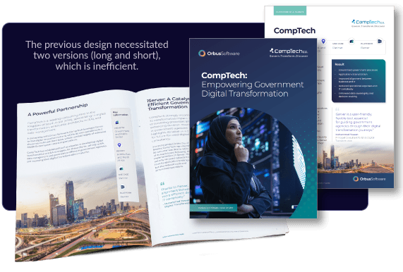
The previous case study layout was a multi-page PDF booklet which included a front and back cover, with individual pages for each section. As these were quite long, a single page overview document was also created, which meant that for each case study two documents would be written and created. As the documents were quite long, this also meant that they were difficult to scan for our prospects, where our USPs could be obscured by the format. In addition to some web pages, case study PDFs are still requested by the sales team as supporting documents.
Solution
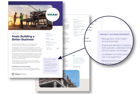
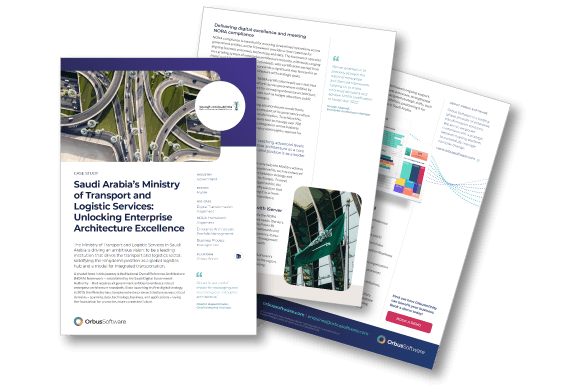
1) Design a template for the case study which shorter and is easier to skim, but that also helps to elevate existing content 2) Show the key objectives that customers have achieved front and centre 3) Include a larger margin where additional points or quotes can be included, without requiring the body text to be read in full
The previous design for the case study PDFs was not something which I created myself, however I was familiar with the lengthy format which necessitated an additional shorter version to be created, putting increased time pressure on copywriting. I wanted to reduce the amount of unnecessary time spent on additional materials, but improving the format of these case studies. The images on the left show case studies that I had artworked using the previous style of template as a guide.
The new design
The new design of the case study PDFs removed the front and back covers, as well as removing the page sections for the content. This both meant that a previous case study of seven pages was able to be compressed into three pages, reducing the need for the additional shorter supporting documentation, but it also meant that the template made layout quicker for the design team.
It also worked better for the target audience of decision-makers (typically C-suite and senior IT management) as key objectives attained were placed front and centre, with quotes and additional points pulled out from the main body of the text. This allows for quick skimming of the information for time-poor individuals.
The next steps
Once the initial designs had been done, further feedback was obtained from members of the team to determine what does and does not work for them. Once the design was approved, it could be rolled out. There was a push to do a greater number of case studies, so this change saved time with those. The rollout was phased, with new case studies being made using this design, then older versions could be caught up once ongoing relevancy was determined.
Creating an internal brand identity, which would sit comfortably alongside the external-facing brand, as well as producing materials for internal campaigns. View project >
This successful campaign described how employees posed a security risk to businesses in three key ways- employee error, hacking and data exfiltration. View project >
This was a self-initiated project designed to improve sales conversions on the website. The original page had key information hidden behind tabs, which made for a limited user experience. View project >