Gartner hosts high-profile global events attended by tech companies and potential buyers.
Challenge
Gartner is a tech analyst business which also hosts events in different specialisms. These are important and expensive high-profile events, attended by Orbus and its competitors. Due to the amount of competition, it is important that messaging and the visuals draw attention.
Solution
1) The messaging is clear and positioned above people’s heads 2) The colours of the stand contrast against the environment (if known) and competitors 3) The top-to-bottom layout needs to show clear prioritisation of content, with knowledge that anything down low may be obscured and text below knee height is illegible 4) Create print-ready artwork files that meet technical specifications
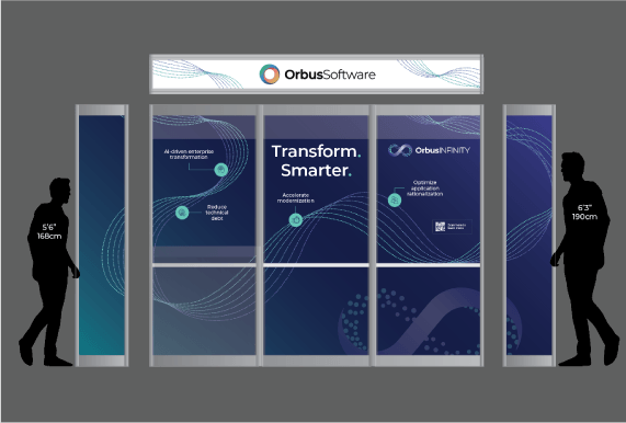
It is important to remember when designing a stand that it is not a flat entity. I see mistakes being made where headlines are too low, or the flow of traffice of a stand is not taken into consideration.
When I work on stand design, I add mockup silhoettes of people so that I have a visual reference of how large the stand is and where eyelines are. For turnkey stands, I also include the panelling poles (where applicable) as this can illustrate how well the content of a stand flows where it is getting interrupted by other elements.
Sending for review
When sending a stand for review it is important to note that not everyone is good at visualising artwork. Therefore I provide 3D stand mockups where time allows. This also helps to show any obstructions, such as TVs, cabinets or tables, which people might forget when they review. Above all it is important to note that the stand will be a 3D object. This means messaging placed close to the floor is unlikely to be seen. You will want your stand to be visible across the event hall as far as possible; this means short bold titles and brighter colours do well in this environment.
On the day
The design side usually ends once the proofs from the printer have been approved. However where possible it is important to review your stand design, this is usually via photographs, where you can compare your stand to competitors.
In the image shown, the green block colour worked well to draw attention, especially where most other stands were dark. More stands started to use the green colour, whereas before the feedback on flat designs requested an all-dark colourway.
Creating an internal brand identity, which would sit comfortably alongside the external-facing brand, as well as producing materials for internal campaigns. View project >
This successful campaign described how employees posed a security risk to businesses in three key ways- employee error, hacking and data exfiltration. View project >
This was a self-initiated project designed to improve sales conversions on the website. The original page had key information hidden behind tabs, which made for a limited user experience. View project >